本文用于记录ggplot2作图相关的代码,会不定期更新。
示例数据格式为
library(tidyverse)

data <- read.csv('test.csv') %>%
  as_tibble()
data %>%
  head() %>%
knitr::kable()| ID | Gender | Age | Education |
|---|---|---|---|
| 1 | M | 6 | M |
| 2 | F | 8 | M |
| 3 | F | 12 | M |
| 4 | F | 19 | H |
| 5 | F | 4 | L |
| 6 | F | 2 | M |
直方图#
..density..: 指明y轴为频率值,为ggplot2内置的变量。
geom_vline: 添加竖直线,线与x轴的交点由xintercept指定。
data %>%
  ggplot(aes(x=Age, y=after_stat(density))) +
  geom_histogram(stat = 'bin') +
  geom_vline(xintercept=mean(data$Age), linetype='dashed', color='blue') +
  ylab('Density')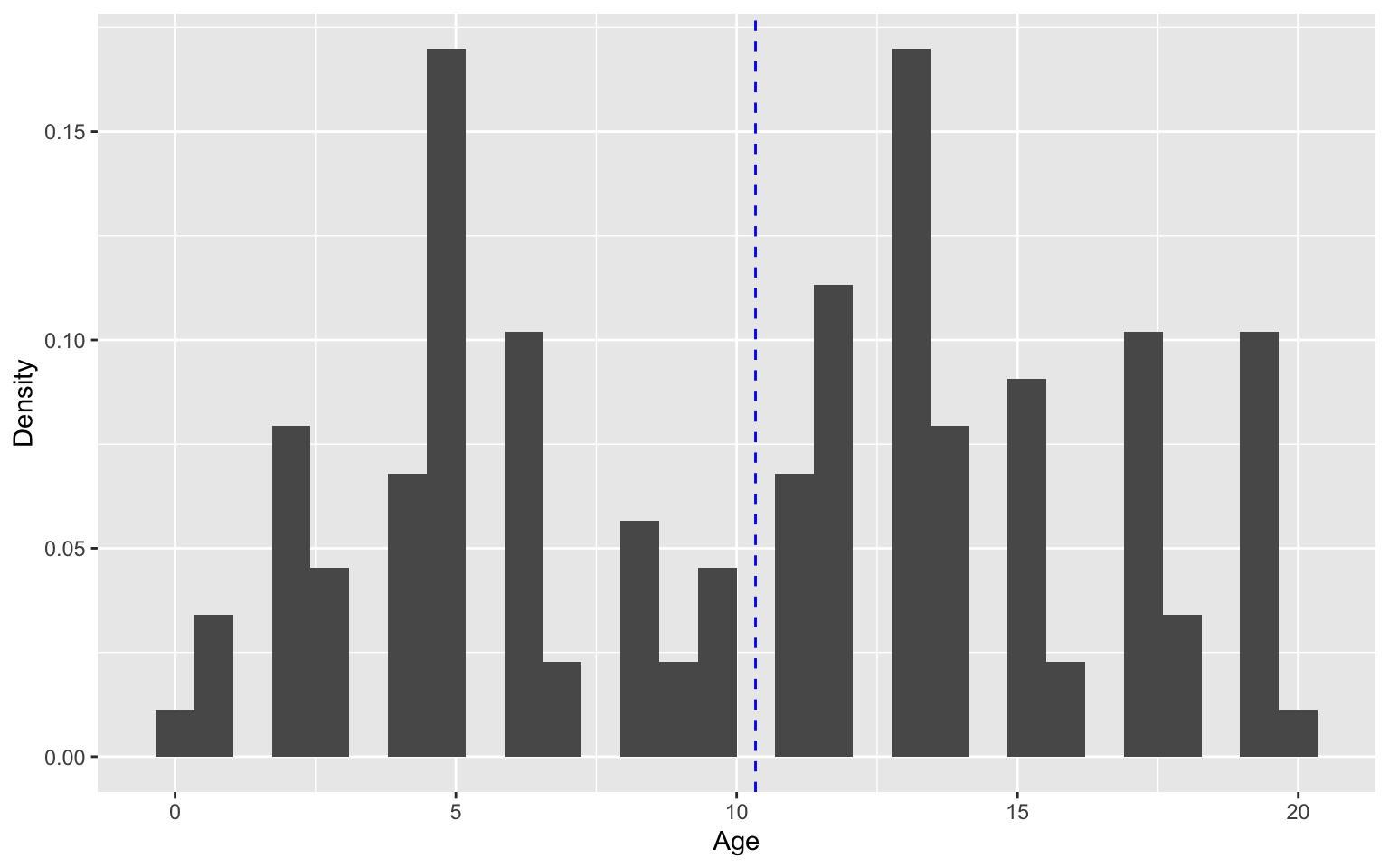
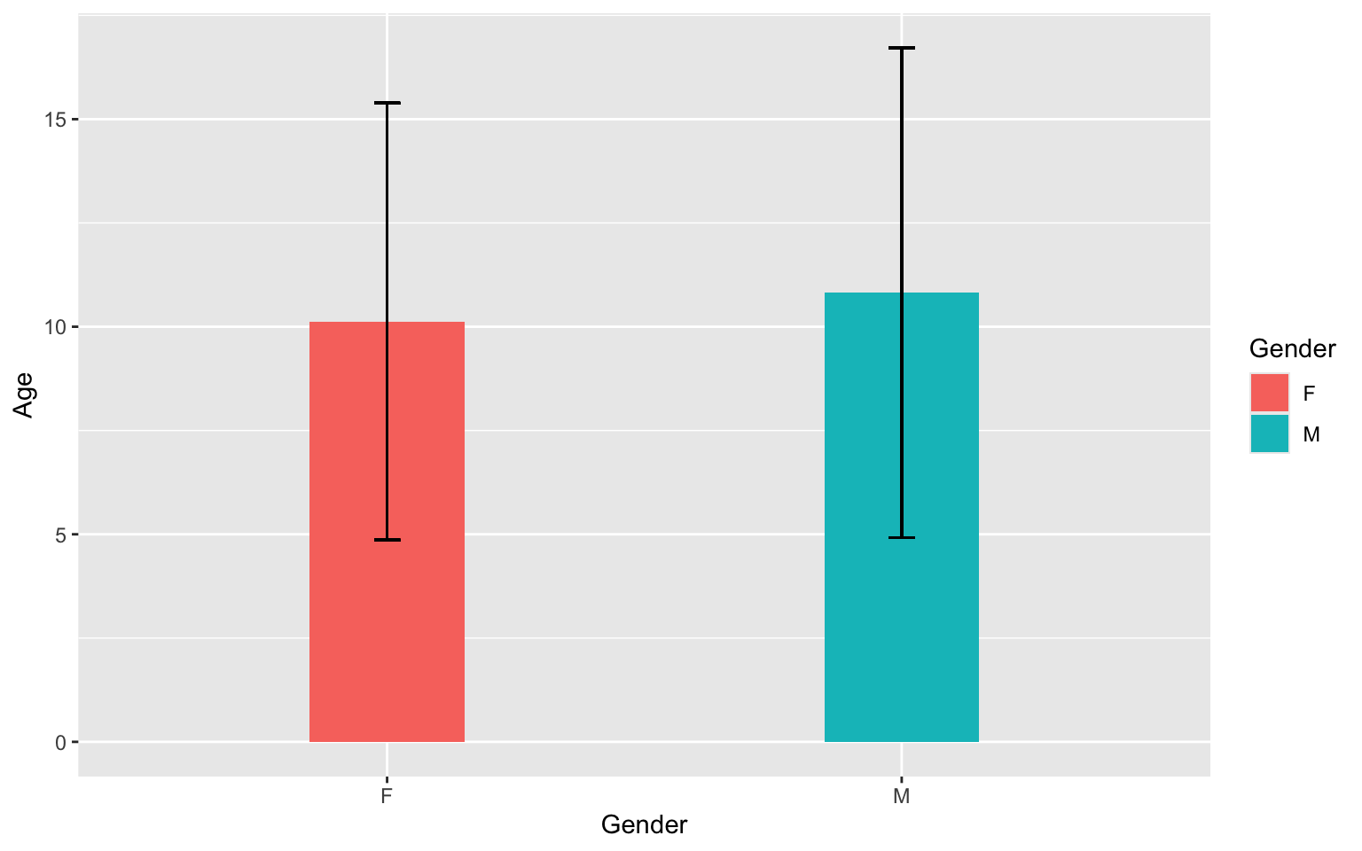
条形图#
ggplot2的条形图,每个柱子的高度直接跟输入数据中的某一列对应,其中一个值会产生一个柱子。这跟seaborn包中catplot的逻辑不太一样:它接受一组数对应一个柱子,因此可以自动生成误差线,而不用单独添加。但也可以自定义函数,将数据转换和作图封装起来,达到类似seaborn中catplot的效果
geom_errorbar: 为每个柱子添加标准差线,也可以给折线图的每个点添加。
data %>%
  group_by(Gender) %>%
  mutate(
    value=mean(Age),
    sd=sd(Age)
  ) %>%
  ggplot(aes(x=Gender, y=value, fill=Gender)) +
  geom_col(position = "dodge", width = 0.3) +
  geom_errorbar(aes(ymin = value-sd, ymax = value+sd),
                position = position_dodge(0.9), width = .05) +
  ylab('Age')